· 4 min
How I learned to use Claude Design (without ever studying design)
I never studied design. Everything I know I picked up over these 5 years as a developer, and in the endless back-and-forth with QA, which trained my eye for detail the hard way.
Even so, here's how I use Claude Design.
Spoiler: there's no magic prompt, whatever everyone out there says. There's a process, and you have to put in the work. Claude won't do all of it for you, but it will do a big chunk.
What I got from Claude Design at first
Obviously everyone starts out wanting the most unique landing page in the universe, and what ends up happening is you get the same structure as literally EVERY website on the internet.
Animations, typefaces like the serif (the most overused thing in design these last few years), sizes, borders, layouts that look straight out of mediocre UI libraries.
Plain, tidy... but soulless.
The first thing I changed: knowing what I wanted
I know it sounds silly, but it's the most important part. Understanding how you want the end result to look, or at least having an idea, so you can guide Claude through the process, is key.
Without that you fall into the same old AI loops. You iterate on the landing page 10 times and all you manage is to burn tokens and end up with something identical to v1.
The second most important thing is references. What I liked, and what fit with what the brand wants to say. With clear visual references, it's much easier for Claude to understand what you're after.
References, but no copying
Before opening Claude Design I look for inspiration and decide what style I want to give the design, whether it's an app or a product:
- Research by hand: sites in the same space as whatever I'm designing.
- I try them out and note which animations, loaders, transitions and so on I like.
- I use styles.refero.design a lot to give Claude references for something very specific that's really hard to explain in words.
Careful with this one: don't lock Claude into the reference. If you do, you're not making a design, you're making a cheap copy of something you liked, and that's terrible.
That's why I ask for variants of that reference: layout variants, variants of a section, of a background. You pick the one that works or, if none of them did it for you, you ask it to rethink based on the most suitable option.
Desktop first, mobile after
I test desktop first (I get the whole mobile-first blah blah blah, but this is how I like it 🤫). Once it's where I want it, I move to mobile.
That's where I go over the key pieces: which ones carry over and which ones need rethinking, because on mobile, as we all know, they can't be solved the same way.
Where Claude struggles: animations
With layouts, responsiveness and symmetric spacing it's very precise, because it keeps the same rules for everything.
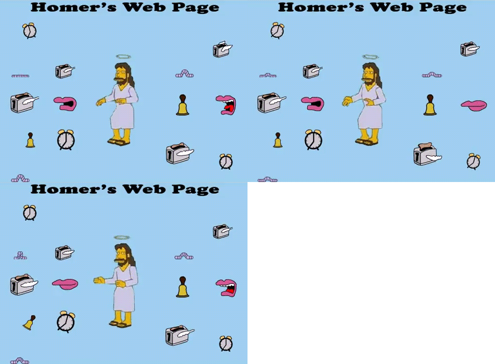
What I struggled with most was the creative side: getting truly professional animations and transitions. That's exactly where Claude struggles, and we have to be as precise as possible in what we ask for so the output doesn't end up looking like this:
That's why references help so much.
And when something doesn't land, I fix it with small, concrete requests. With the hero background, for example, it went something like this:
"Bigger, lower, filling the whole box to the right of the title without touching the text."
Little by little, until it's right.
The famous design system
In my case I built it after the landing page, since before that I hadn't pinned down what I wanted. With the landing page done, I still had all the rest of the design ahead of me, and all of it had to share the same look to feel consistent.
If everything is "similar" but you use different sizes, typefaces or even colors (please, don't), you'll end up with a mix of things with no identity. And that's exactly what we should be after: a brand identity.
Doing it in that order was spot on, because by then you've already mapped everything you built in the project.
A tip I picked up: Claude has a much easier time building it if you keep a
DESIGN.md in your project than if you throw it the URL and let it figure
things out. With the URL it has to map the entire site, and it's bound to miss
something. The DESIGN.md holds your project's design rules, and that's VITAL
for a design system.
The result
I did the same with this portfolio, both the first version and v2, and the jump was just as noticeable. All thanks to these steps.
What never to do
- Open Claude Design without knowing what you want.
- Follow trends just because (yes, I'm talking to you, serif lover, we've all been there).
- Copy the reference as-is instead of asking for variants. Just don't.
- Use different sizes, typefaces or colors in each piece.
Wrapping up
This isn't the absolute truth, it's the way I found that works for me today. Like everything in IT, it'll keep changing, and the idea is to find a process you're comfortable with and keep iterating.
Claude Design won't turn you into a designer. But if you know what you want, it gets you a whole lot closer to what you have in mind.
I hope it helped. Cheers 🙌🏻